


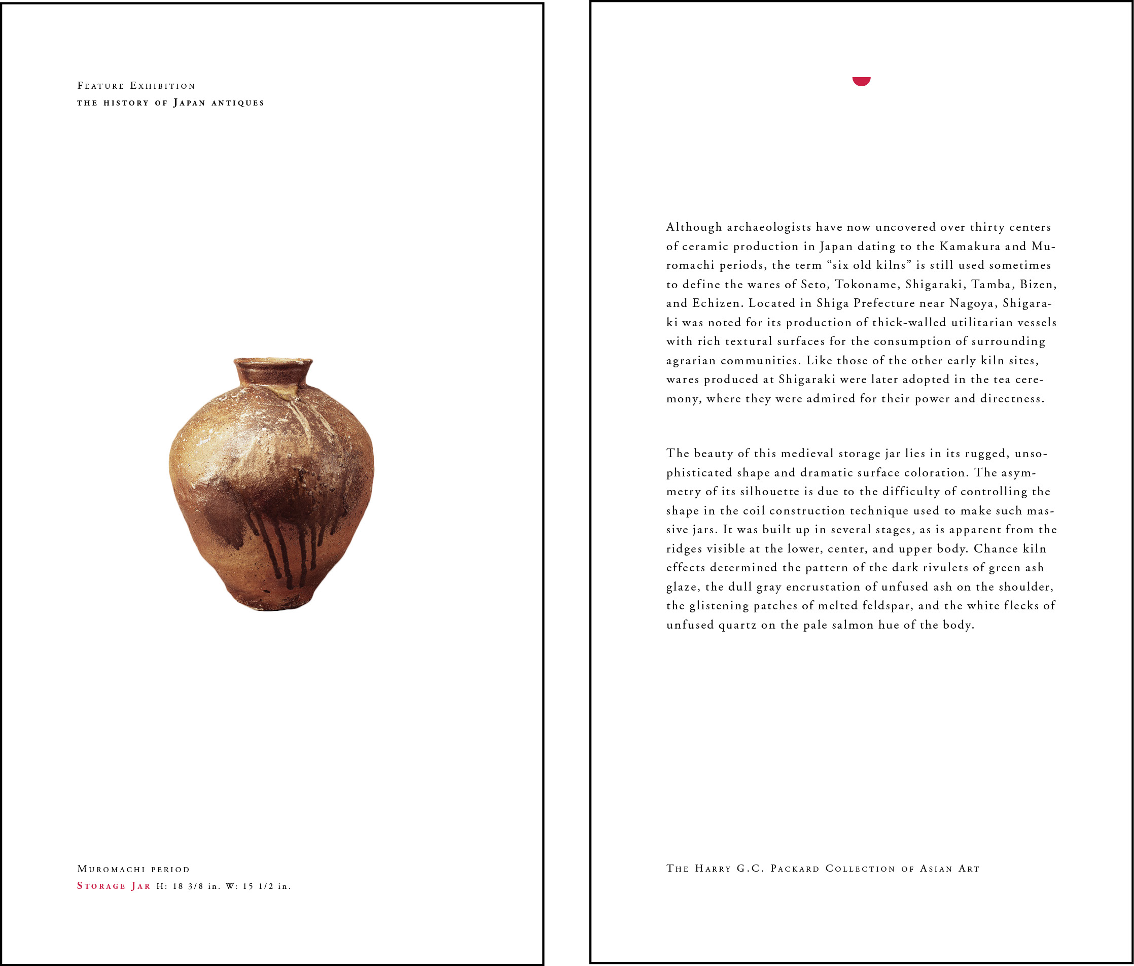


#TYPOGRAPHY #GRAHICS
It is a project about designing a catalog for the Japanese Arts exhibition held in The Museum of Modern Art. The idea of using red dots as the main visual component is because I want to bring out the concept of Japanese flag. Also, the reason why I used red and white is because these two colors are widely used in many other artworks throughout Japanese history. The color red in Japanese culture can be seen as an icon of the sun, and the color white is the symbol of pureness. The layout and the form are generated based on the Japanese aesthetic which is simple and clean.