


#BRANDING #IDENTITY
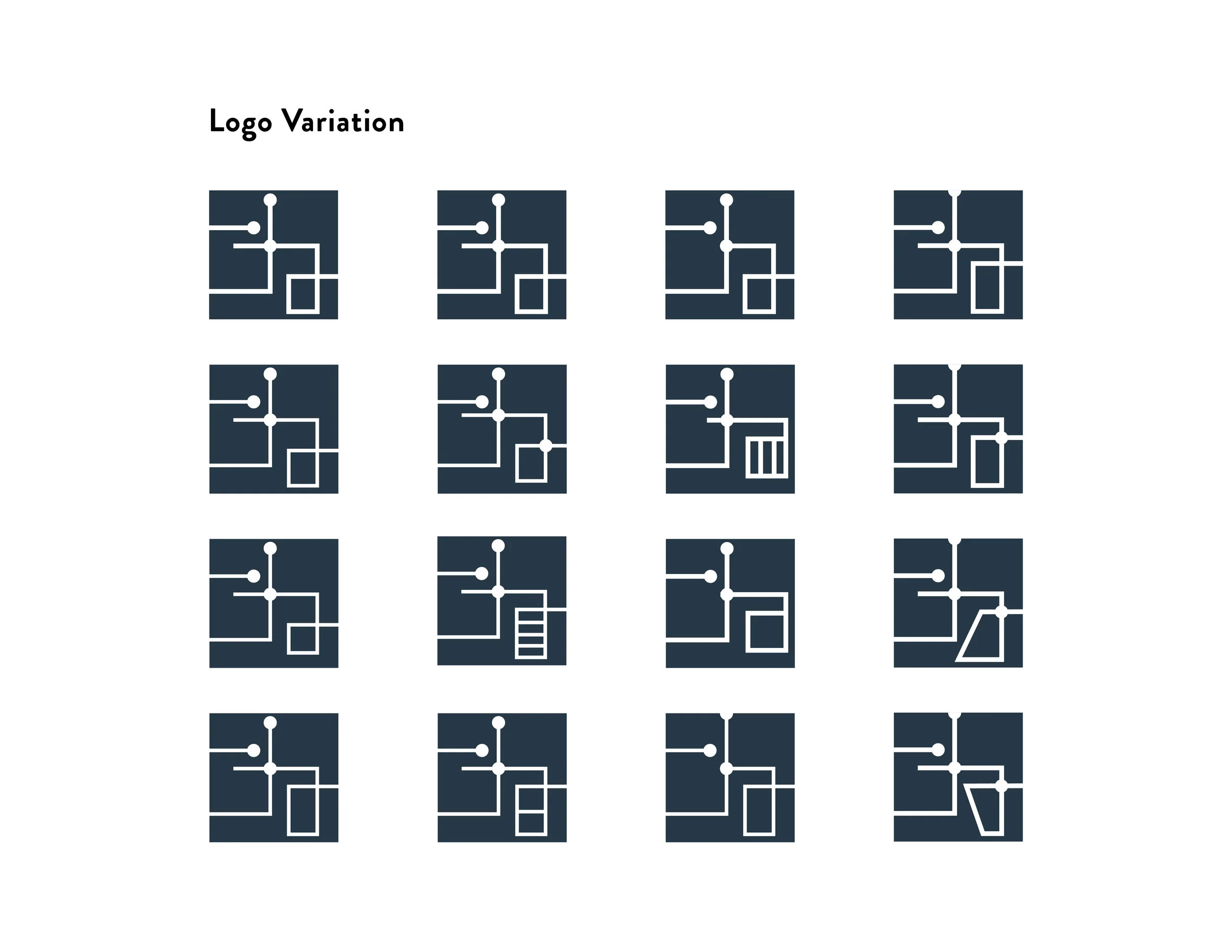
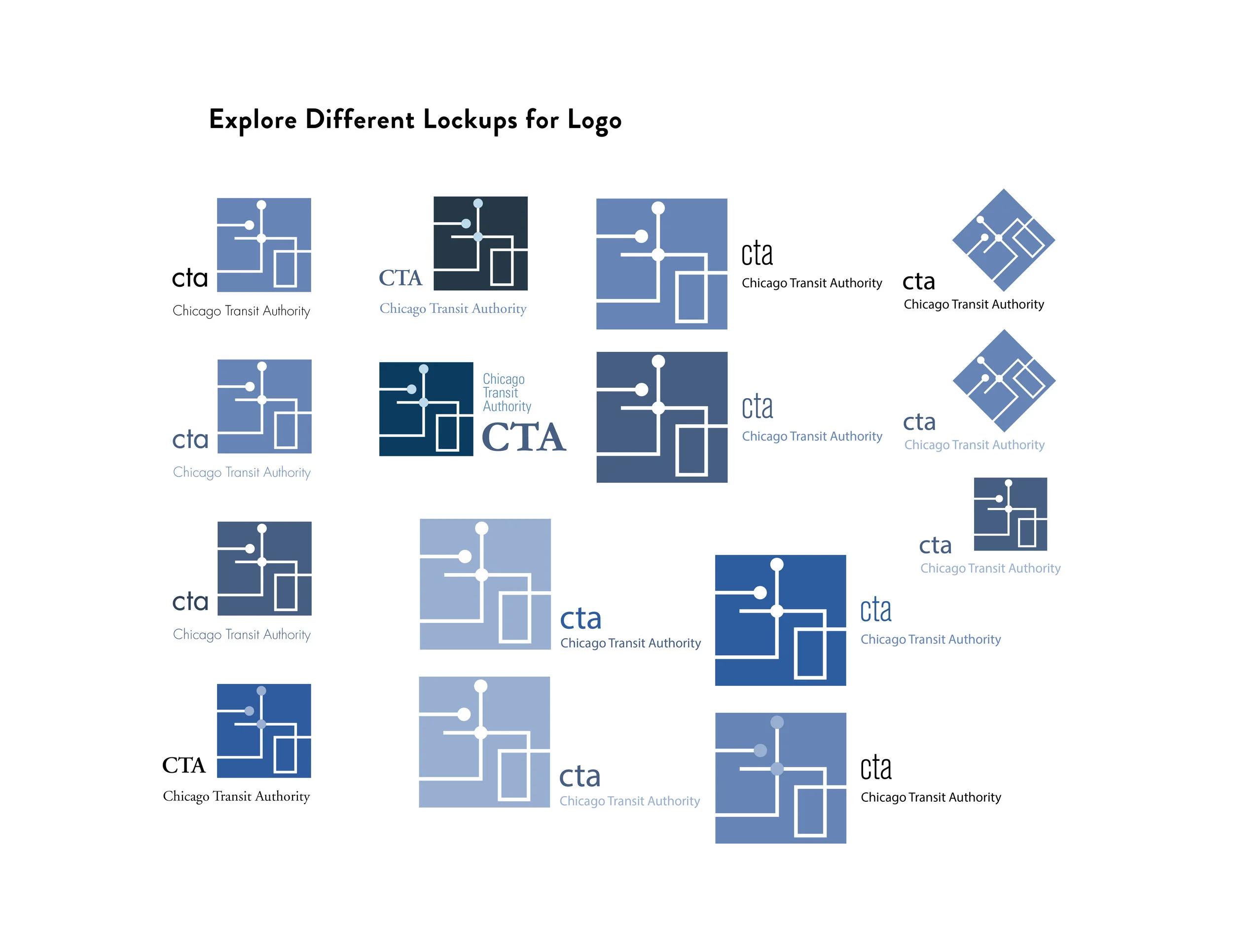
In this project, I redesigned the logo for an existing brand. I chose CTA, the transit authority of Chicago to be my subject. It was important to create a logo that expresses the characteristics that made the brand stand out among its competitors. In comparison to the existing CTA logo, what I try to achieve here is to add a component which can represent the core of the brand. In the end, I decided to go with an idea of combining subway route with the typography of the brand name.